linden82 wrote:Hi Claudius, I'm going with a dark armour, with a blue ish tinge and some green accent colours.
I spent a few hours last night getting it started.
Flesh is a purple/pink. Still need to take the flesh up a notch to make it pop. Green accent needs work and I think I'll adjust the stripes on the head.
Still don't know what colour I'm going to do the bases yet.
I'd suggest a teal/blue for the base, but vivid and bright. You might be able to get away with sand/dry dirt. The "green" accent you have looks more blue to me, personally. I agree that it needs some work. Do you have an airbrush? I'd consider tracing those lines with an airbrush to get a slight OSL and add more intensity to the black armor plates.
saturatedFat wrote:Thanks for pointing out the guides for airbrushes. I held off on getting one to force myself to get better at brushwork. But it really is time consuming, so I would probably benefit from starting with an airbrushed basecoat and doing brush layers on top of that.
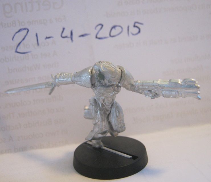
Anyway here's the Mobile Brigada all primed up.
Nothing prevents you from getting better at brushwork, even if you have an airbrush. They're useful for different effects. The key is to find which effect you're going for and which tool can best get it done. I've painted with the foam that comes in the blisters before, because I wanted that crusty/flaked effect.
UnderConstruction wrote:OH GOD WHAT THE HELL AM I DOING
SOMEONE SEND HELp, TRAPPED IN PAINT FACTORY, NOT GOOD WITH AIRBRUSH, hod wid get here?
What're you looking to do? OSL? NMM? Shading? Highlights/blending?
I can't help you if you don't have a goal in mind.
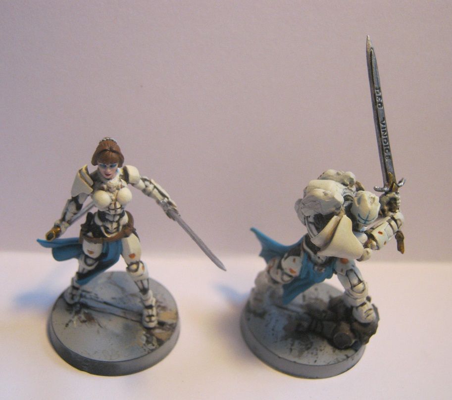
JGonzalez wrote:All these updates are keeping me motivated!
I'm not happy with my current direction on the base But I've a vision and I'm pushing through my funk.

I... Don't like those whites. They look too soft to be armor. The edges also lack a lot of definition. How're you painting the white? Just straight and then shading? It looks like it needs some color saturation to it.
My suggestions:
-Better define the edges of the whites
-Don't use straight white for the majority of the white, use Ivory or another off-white color for the base color. White is reserved for edge highlights and blending
-Be more careful with how harsh some of those shadows appear.
It looks fine, but could be improved. Sorry if I sound harsh. Just trying to help.
 Viewed 16316 times")
 Viewed 16316 times")

 Viewed 16259 times")

 Viewed 16056 times")
 Viewed 16056 times")


 Viewed 15987 times")


